1.I think I am a lot better at graphic design than animation.I'm more creative than tech savvy so it's easier for me to design.I'm excited for video production and to see if I'm good at that.
2.I need to improve on using different programs and understanding them.I would like to make more clean and professional looking projects.I also need to time manage better.
3.I like doing sketchbook projects the best out of everything.I discovered that drawing is something fun for me and I would like to continue that.
4.I would try and do a lot better on my house project for animation and get the animation part of it finished.I feel it was not my best work.
5.I learned a lot more about what all goes into logos and animated movies and how it's much harder than you would expect.I also learned some good skills on communication and leadership.
6.My goal for next semester is to learn as much as I can about video software and how to use it.I hope to also keep my A and to keep loving this class.I am overall very excited of the rest of my e9 experience.
Friday, December 16, 2016
Web Design Questions
A.The process for this project was watching a series of six 15 minute videos and following the instructions.We used dreamweaver for building our website.It probably took me about 3 or 4 class periods to complete.
B.I made sure I got going on all of the videos and did the instructions as the video told me.I tried to get two done everyday.
C.Some of the things with coloring were a little bit hard for me.Overall,I thought this was our easiest project this quarter so I didn't have too many issues with it.
D.I learned a lot about what all goes into designing a website and how dreamweaver works.I also learned about code and that to be a web designer you have to know at least a little bit about how code works.
E.I liked doing this project and have a good outlook on the experienceI would probably enjoy working on something like this again.
F.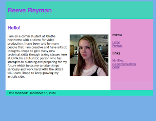


Monday, November 28, 2016
Elevator Pitch
I am an e-comm student at Olathe Northwest with a talent for video production.I have been told by many people that I am creative and have artistic thoughts.I hope to gain many new technical skills through taking classes here at ONW.I'm a futuristic person who has strengths in planning and preparing for my future which helps me to take things seriously and work hard.With the skills I will learn I hope to keep growing my artistic side.
Thursday, November 17, 2016
Youtube Video
<iframe width="560" height="315" src="https://www.youtube.com/embed/4Yuvyfdm4a8?rel=0" frameborder="0" allowfullscreen></iframe>
Monday, November 14, 2016
Arcs Animation

For our second project in animation,we learned how to animate a ball bouncing in an arc.We used the same squash and stretch principles but also learned what a ball bouncing in an arc looks like.This project was much easier for me than the last because I am starting to get familiar with the features of photoshop.
The new things we did was learn how to tween slides together.It was a little hard to figure out.It came out not as expected but not terrible either.I think in the future this will help me a lot with any presentation type projects that need to be done.
My finished product turned out well and taught me a lot about animation principles.I think I am starting to get the hang of this and am glad I can continue to develop my skills.
Ball Gif Project
 Our first project in animation was to animate a ball bouncing up and down in Photoshop.By doing this we learned about the principles of animation which for this were squash and stretch.This is a principle of animation that says that a ball has to get narrower and longer as it goes down and flatten when it lands for it to look like it's bouncing.
I at first had a hard time getting this project started and going.I'm generally not a very tech-savvy person so things like this don't really make sense to me right away.I eventually started getting better at it as I continued on.I finished a little later than everyone else but I still got it done.
Overall,I liked this project.It helped me learn a lot of new things about computers and Photoshop.I'm glad was able to do it and understand a little more about animation,something we deal with everyday.
Tuesday, October 18, 2016
Social media's effect on college admission
I thought the article we read yesterday was very interesting. It talked about how colleges are starting to look at the social media accounts of people applying for their school, often without telling the student. Sometimes after viewing social media accounts students are not admitted to the school and are not given a reason or a chance to explain. I think it was a good reminder that you should always be careful what you put out on the internet. Even if you don't plan on going to college, any job you have could look at your social accounts and fire you or not want to hire you in the first place. I think overall it just made me think about what I personally want to be letting the world see about me and what could potentially have a negative impact on my future career.
Friday, October 7, 2016
Handwriting Assignments
This week in ecomm was all about handwriting and how it showcases personality. Our first assignment was to make a logo, using the rectangle tool on adobe illustrator, that was our name. It was a little bit challenging for me, because when I began creating my logo, everytime I tried to make shape, another would pop up that I didn't want. I ended up getting it made, though I had these setbacks. It wasn't as pretty as it could've been, but I liked the colors I used. I think the shape of the letters could be seen as quirky or not very neat, it depends on who is looking at it. Here it is below.

Our next assignment was to write our signature in our sketchbook and then write ten adjectives that described our personality. Then we had to write our name in 3 different fonts that fit with our character traits. My ten personality traits were; stubborn, empathetic, ambitious, reliable, passionate, punctual, different, indecisive, loyal, and analytical. I chose fonts that I thought represented different, passionate, and ambitious. I found the fonts by going to google images and searching "typography".Ultimately, I think it looks nice and represents me well. .
.
 .
.Tuesday, September 27, 2016
Presentation Skills
Last week in Ecomm, we learned about the importance of presentation skills. We watched ted talks from influential people such as Bill Gates and Jamie Oliver and graded them on their appearance, eye contact, and posture.We were then given our assignment, which was to present our last assignment, which was making sketches and blogging about it. We printed out the blogpost and stood in front of the class and were graded on the same things we graded the people in ted talks on.
Before we did any of this, we presented for just one other person and they told us what went well and what could've gone better. I usually don't get too nervous about presentations and my partner didn't have anything for me to improve on, so I felt pretty confident in how the presentation would go. I didn't think about dressing professionally, but that day I was wearing a skirt so it worked out.
From the presentation I learned some things that I hadn't really thought about before. For example, appearance can play a big role in how people respond to your presentation. Also, eye contact can be very difficult to maintain if you haven't rehearsed your presentation. In the end I got a good grade, so I'm happy,but I will definitely use these skills in the future.
Friday, September 16, 2016
The Sketchbook
For this week's assignment in ecomm, we were instructed to draw
logos on a page that we liked and thought represented graphic design. After we
filled the page with logos, we had to sign the work in the lower right corner.
We could also do typography, but I chose to stick with logos. At first, I just
started drawing random logos, but then decided to do logos for various musical
artists I like. There's only 3 logos on my page that do not represent an
artist. I also chose not to do color, because I think it would've been too much
going on and clashing if I colored every single logo.
I liked this assignment, because I really like looking at things and
then drawing them. Through the course of the assignment, I realized how many
logos there really are in the world. Also, that graphic design is very unique
because it can be interpreted in a different way by everyone
Overall, I am happy with how this assignment turned out. I think I made
it look neat and they all fit together in a nice way. The only thing I would
change is the amount of eraser marks on my page. Other than that I think it
looks good.
To the right is a picture of the logos I chose to do. 

Monday, September 12, 2016
Favorite/Least Favorite Colors
Favorite Color
I don't really have any memories associated with black or pastel blue(my favorite colors). I pretty much just like them because those are the colors I like in clothes. I've always liked blue ever since I was little. It's a very soothing color and it reminds me of nice weather. Black has been a more recent thing for me. It goes with everything and it's basically the opposite of bright colors,which I hate. I don't know many products that use black for their designs and packaging besides Mountain Dew Black. Every time I think of pastel blue products I think of Downy fabric softener. I think they made it that color to make you think of relaxing and fresh things. If I could change one everyday product to one of my favorite colors, it would probably be my phone. I don't like the silver of my phone, I would much rather have a matte black phone. As far as the type of colors pastel blue and black are, I would definitely say black is a dark neutral color, while pastel blue is a cool tint.


Least Favorite Color
My least favorite color is definitely neon yellow. In general, I strongly dislike any bright colors. I usually only wear black and white with a couple very pale, pastel colors mixed in. Bright colors are just so harsh on the eyes and in your face. They kind of just remind me of the little girl's clothing store Justice. When I shopped at Justice I had a very poor taste in fashion, so I think I kind of have bad memories associated with bright colors. Neon yellow is just the worst to me, because it's the loudest of all the neon colors. As far as I know, no products use neon yellow for their packaging, probably for good reason, as no one really likes looking at that color. I think neon yellow would be considered a bright tint.

Friday, September 2, 2016
Illustrator Experience
This week in Ecomm we learned about different colors and the messages they convey. We also learned about what colors go well with each other and different features of Adobe Illustrator. We learned how to make different shapes on Illustrator and at the end of the week we had to use the skills we learned to create a picture with shapes. It was difficult to think of what to make so I didn't really have anything planned. I just opened the software and started creating shapes until I figured something out. I ended up making a rainbow colored bear character.I really liked it because it has a lot of colors in it and it's kind of cute. It's not super detailed or great looking, but it's quirky and charming in its own way. On the left is my bear graphic, and on the right is what I created at the beginning of the week.


Friday, August 26, 2016
Sidewalk Chalk Project

For our first project in e9, we had to get in teams and create a flag that represented everyone on the team. First, we did a tiny bit of research on the psychology behind different colors. Each person decided on a color and a symbol that best represented them. Then, we had to figure out how we could put all of our symbols together in one flag. We brainstormed for a little while until someone came up with the idea to create a tree with a branch for each person to put their symbol on. After we figured that out, it was pretty easy to create the flag. We added a ribbon at the bottom of the tree as we were creating so we could all have our names together and on the flag.
When we finally went outside to create the final flag with chalk, it was a picture day and pretty rainy, so it was kind of hard to figure out how we were going to draw without getting dirty and wet. We basically just took turns drawing parts and then running under the overhang on the side of the school, which actually ended up being a good system for us. After we finished we decided to add the Northwest raven and ONW in the middle of the tree. Above is a picture of our finished project.
On the flag, my symbol is the black heart with a blue outline. Black represents darkness and mystery and blue represents calmness and tranquility. I chose a heart,to show that I'm not just mysterious or something I also love my family and friends and am a relatively calm person.
I think overall we worked really well as a team. We let every persons ideas be heard and were respectful of each other and didn't put all the work on one person. We all had pretty different personalities, but it actually helped with brainstorming, because everyone had different ideas.The only thing I would've changed is the colors we used on the flag, because they didn't go together quite how we thought, but that didn't really have anything to do with a lack of cooperation and teamwork. For me, it was a good experience and I would definitely do something like this again.
Below is a picture of our whole team working on the flag outside.

Subscribe to:
Comments (Atom)